2023 - present
Taking The Programmers University from 0 to 1,000 active users and generated $20K in revenue
Taking The Programmers University from 0 to 1,000 active users and generated $20K in revenue
Taking The Programmers University from 0 to 1,000 active users and generated $20K in revenue
SKILLS:
Website design
Website design
Website design
UX Research
UX Research
UX Research
Prototyping
Prototyping
Prototyping
Mobile App design
Mobile App design
Mobile App design
Background
Background
Background
The Programmers University is an online platform that offers coding courses for aspiring developers. It focuses on providing hands-on learning with real-world projects and personalized mentorship.
The platform is designed to guide students from beginners to proficient developers by using the latest technologies and practical experience, making it a valuable resource for anyone looking to build a career in tech.
Core problem
Core problem
Core problem
As the lead designer for The Programmers University, I was asked to redesign the landing page to improve how it communicates with potential students and to drive more enrollments. The old design wasn’t working, t looked outdated and wasn’t easy for users to navigate.
People couldn’t clearly see the program’s benefits like hands-on learning and job placement help, and that confusion was leading to fewer sign-ups.
The goal is to give the page a fresh, modern look and make it easier for users to find the information they need, like course details and how the program can help them land a job in tech.
The aim is to make the site more engaging and inspiring so that it converts better and makes students excited to join.

Core problem
Core problem
Core problem
After analyzing the pain points of the old website, the redesign of The Programmers University landing page focused on improving clarity, user experience, and engagement.
We crafted a more modern, visually appealing design that immediately communicated the core value of the program: helping students become job-ready full-stack developers in just one year.
We simplified navigation and provided clear calls-to-action (CTAs), such as "Our Programs" and "Apply Now," making it easier for users to explore the curriculum, understand program benefits, and enroll.
The new layout was designed to highlight key offerings like hands-on learning, job placement assistance, and structured mentorship. We incorporated testimonials, real student success stories, and added badges for skills like HTML5 and JavaScript, further instilling trust and showcasing the institution’s credibility.
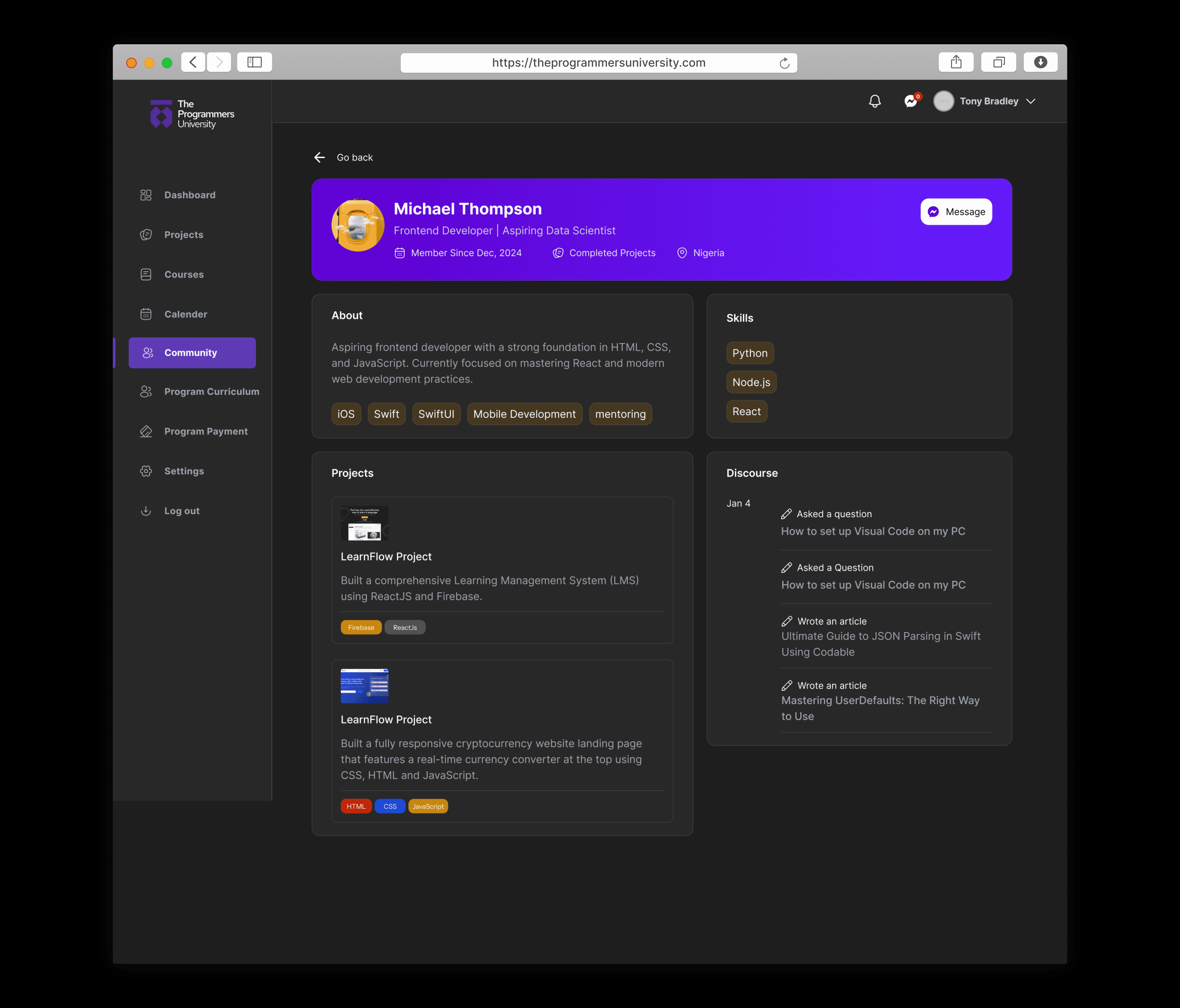
Students Dashboard
Students Dashboard
Students Dashboard
Apart from the website, I also took care of designing the entire dashobard for the students/users. It's a one-in-all app to manage chats, continue course, see assessment/assignment, join weekly community calls, and more.


If Amarachi /ah-mah-RAH-chee/ is a tough name to pronounce, feel free to call me "Grace"
I document my journey as a designer, sharing what works, what doesn’t, and the lessons I learn along the way—covering Framer, job tips, and more. Tag along! 👉🏽


All rights reserved ©
Amarachi Iwueze Portfolio❤️
Tuesday, July 8, 2025
If Amarachi /ah-mah-RAH-chee/ is a tough name to pronounce, feel free to call me "Grace"
I document my journey as a designer, sharing what works, what doesn’t, and the lessons I learn along the way—covering Framer, job tips, and more. Tag along! 👉🏽
All rights reserved ©
Amarachi Iwueze Portfolio❤️
Tuesday, July 8, 2025